The product entered a category where customers often arrive with questions about ingredients, use and credibility. The website had to educate without becoming clinical and sell without relying on unsupported claims.
04 / Commerce experience
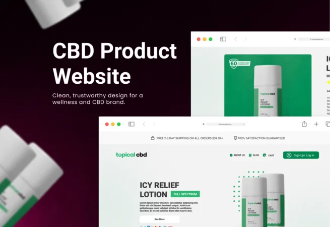
CBD Product Website
A focused product story balancing education, trust and a direct path to purchase.
 Selected work · 04
IndustryConsumer wellness
Visual Side roleDigital brand, web experience and conversion structure
Delivery modelFounder-led project
Project screens / 02
A closer look at the work.
Explore the interface, content and system decisions in context. Select any screen to open the complete gallery.
From the real
challenge to a usable system.
The content model separated reusable product facts, ingredients, usage guidance, FAQs, proof and policy content. This created consistency across landing, product and educational pages.
The result is a clearer digital storefront that makes the product easier to understand and the brand easier to trust.
What needed to change
Problem
The product entered a category where customers often arrive with questions about ingredients, use and credibility. The website had to educate without becoming clinical and sell without relying on unsupported claims.
Brand story, product information, usage guidance, trust content and commerce actions competed for attention. The challenge was to create a calm sequence that helped a new customer understand the offer before asking them to convert.
- Explain an unfamiliar product with clarity
- Balance education, credibility and conversion
- Create room for compliant product communication
How we shaped the experience
UX process
We organized the journey around the customer’s questions: what the product is, who it is for, what it contains, how it is used and why the brand can be trusted.
Progressive disclosure kept the primary story concise while product detail, ingredients, guidance, FAQs and policies remained easy to reach. Conversion actions were introduced at decision points rather than repeated without context.
- Question-led product journey
- Progressive education and trust content
- Contextual commerce and contact pathways
How the system connects
Architecture
The content model separated reusable product facts, ingredients, usage guidance, FAQs, proof and policy content. This created consistency across landing, product and educational pages.
A modular structure gave the brand room to add products and campaigns without rebuilding the entire experience. Compliance-sensitive content had defined locations so it remained visible and manageable.
01Reusable product and ingredient content02Connected education, trust and policy modules03Scalable landing and product-page structure
How consistency was built
Design system
A calm wellness language combined confident typography, packaging-led color and clear product imagery. The system was designed to feel credible and contemporary without resembling a generic clinical template.
Product cards, benefits, editorial content, comparison, FAQs and conversion modules shared one visual hierarchy. Accessibility and readability guided color contrast, typography and interactive states.
01Packaging-connected digital identity02Reusable editorial and commerce modules03Accessible typography, contrast and controls
How the work became build-ready
Development
Responsive templates and CMS-ready content blocks translated the experience into a practical marketing and commerce build.
The scope included performance-conscious media, structured product content, technical SEO and defined locations for policy and compliance material. Reusable modules reduced the cost of future products and campaigns.
- Responsive commerce and content templates
- CMS-ready reusable sections
- Performance, structured content and SEO guidance
What the project unlocked
Outcome
The result is a clearer digital storefront that makes the product easier to understand and the brand easier to trust.
Customers receive a more deliberate path from education to action, while the business gains a reusable system for product launches, campaigns and ongoing content management.
- Clearer product differentiation
- Stronger trust throughout the buying journey
- Reusable foundation for future products and content
Client perspective
“The work gave the brand a much clearer and more professional digital presence.”Consumer brand owner