Social discovery is easy to make busy and difficult to make trustworthy. The platform needed to help people find relevant communities and events, understand who they would meet and feel confident enough to participate in person.
02 / Social platform
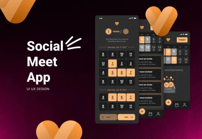
Social Meet App
A product system that turns discovery, community and in-person connection into one clear journey.
 Selected work · 02
IndustryCommunity & events
Visual Side roleBrand, product design and platform experience
Delivery modelFounder-led project
Project screens / 15
A closer look at the work.
Explore the interface, content and system decisions in context. Select any screen to open the complete gallery.
From the real
challenge to a usable system.
The platform model connected people, interests, groups, locations and events through shared relationships. This made discovery more relevant and allowed the same content to appear in multiple useful contexts.
The final system creates one coherent journey from first discovery to meaningful participation and continued community engagement.
What needed to change
Problem
Social discovery is easy to make busy and difficult to make trustworthy. The platform needed to help people find relevant communities and events, understand who they would meet and feel confident enough to participate in person.
Profiles, interests, groups, locations, invitations and events existed as connected ideas but not yet as one understandable journey. The challenge was to reduce choice overload while preserving the sense of energy and possibility that makes a social product engaging.
- Connect online discovery with real-world participation
- Build clarity and trust into social decisions
- Support growth without fragmenting the core journey
How we shaped the experience
UX process
We mapped the experience from first entry to repeated participation: choosing interests, building a useful profile, discovering people or events, evaluating relevance, joining and following up afterward.
Flows prioritized intent and context before volume. Search, recommendations, event detail, invitations, RSVP and post-event connection were prototyped as one continuous loop rather than separate features.
- Interest-led onboarding and discovery
- Profiles, groups, event and invitation flows
- Participation, follow-up and retention journey
How the system connects
Architecture
The platform model connected people, interests, groups, locations and events through shared relationships. This made discovery more relevant and allowed the same content to appear in multiple useful contexts.
Privacy, visibility, membership and notification logic were considered at the architecture level. That prevented trust and safety decisions from becoming last-minute interface patches.
01Connected people, interest and event model02Membership, privacy and visibility rules03Reusable discovery and notification logic
How consistency was built
Design system
The visual system needed to feel social and energetic without becoming noisy. A flexible identity was paired with a restrained product layer so content, people and actions remained easy to scan.
Profile, event, group, message and status components were designed as a shared library. Consistent hierarchy, interaction feedback and safety states carried the experience across responsive web and mobile surfaces.
01Flexible social identity and product language02Reusable people, group and event components03Responsive, privacy and trust states
How the work became build-ready
Development
Responsive behavior and implementation specifications translated the concept into a product that could be delivered consistently across devices.
The handoff connected component rules to platform states, including empty results, pending invitations, restricted content and notification behavior. Priority journeys were packaged as testable prototypes for implementation review.
- Responsive component specifications
- Backend-ready platform state mapping
- Testable prototypes for priority journeys
What the project unlocked
Outcome
The final system creates one coherent journey from first discovery to meaningful participation and continued community engagement.
Instead of treating social features as isolated modules, the platform now has a reusable experience model that can support new communities, formats and locations while maintaining clarity and trust.
- More direct path from discovery to participation
- Consistent trust cues across the experience
- Scalable foundation for new community formats
Client perspective
“Great communication, fast response and delivery above expectations.”Product owner · Australia