A connected environment can contain dozens of devices, live signals and automation rules. The original challenge was not adding more controls—it was helping people understand what was happening and act without hesitation.
01 / Connected product
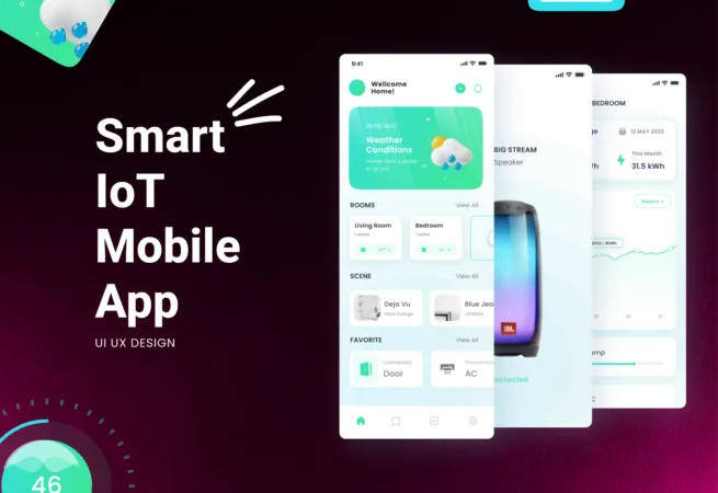
Smart IoT Mobile App
A connected mobile experience structured around real-world device control, visibility and confidence.
 Selected work · 01
IndustryIoT & smart environments
Visual Side roleProduct strategy, UX architecture and interface design
Delivery modelFounder-led project
Project screens / 16
A closer look at the work.
Explore the interface, content and system decisions in context. Select any screen to open the complete gallery.
From the real
challenge to a usable system.
The product was structured as a connected hierarchy: account, property, room, device and automation. This gave every screen a clear context and made it possible to introduce new hardware without redesigning the core experience.
The result is a more coherent path from onboarding to daily control, with the complexity of the connected environment contained behind a calm and repeatable experience.
What needed to change
Problem
A connected environment can contain dozens of devices, live signals and automation rules. The original challenge was not adding more controls—it was helping people understand what was happening and act without hesitation.
Device setup, room-level control, alerts and automation all competed for attention. We reframed the product around everyday decisions: what needs attention now, what is running, what can be controlled safely and what should happen automatically.
- Make live device status understandable at a glance
- Reduce friction during setup and first use
- Keep advanced automation available without overwhelming everyday control
How we shaped the experience
UX process
The UX process began with the physical environment rather than a list of screens. We mapped how people move between properties, rooms and devices, then identified the moments where status, feedback and control matter most.
Core journeys covered onboarding, device pairing, dashboard monitoring, room navigation, direct control, alerts and routines. Early flows and interface prototypes were used to test hierarchy, safe actions and recovery states before visual detail was applied.
- Environment and device journey mapping
- Progressive onboarding and pairing flows
- Control, alert, offline and error-state prototypes
How the system connects
Architecture
The product was structured as a connected hierarchy: account, property, room, device and automation. This gave every screen a clear context and made it possible to introduce new hardware without redesigning the core experience.
Telemetry, permissions, alerts and routines were treated as shared system layers rather than isolated features. Navigation and data relationships were documented so product, interface and engineering decisions could follow the same model.
01Property, room and device hierarchy02Shared model for telemetry, alerts and routines03Role and permission logic for multi-user environments
How consistency was built
Design system
A reusable interface language translated complex system behavior into familiar visual patterns. Device cards, status signals, controls and charts were designed to remain clear across different equipment types.
Color was reserved for meaningful status and action feedback, while typography and spacing carried the everyday hierarchy. Components included interactive, loading, offline, warning and disabled states so the system could communicate reliably beyond the ideal path.
01Reusable device and room components02Accessible status and signal language03Consistent interaction states and responsive rules
How the work became build-ready
Development
The design was prepared as an implementation system, not a collection of static screens. Component behavior, state changes and responsive patterns were documented alongside the visual specifications.
Handoff defined data dependencies, loading behavior, edge cases and reusable patterns for dashboards, controls and charts. This gave development a clearer contract for translating the experience into a maintainable mobile product.
- Component and interaction specifications
- Loading, offline and failure-state behavior
- Build-ready mobile layouts and reusable patterns
What the project unlocked
Outcome
The result is a more coherent path from onboarding to daily control, with the complexity of the connected environment contained behind a calm and repeatable experience.
The system gives users clearer visibility, gives engineering reusable interface logic and gives the product room to support additional devices, properties and automation types over time.
- Clearer daily control and system feedback
- Scalable patterns for future device categories
- One shared product language across design and implementation
Client perspective
“Visual Side quickly understood the product and improved how everything works—from structure to user flow.”Startup founder · Spain